Delphix version 5.2 has recently been released and with it a complete new look and feel to the virtualization engine GUI. Finally the guys at Delphix have completely removed Flash from the front end, a welcome relief, and with it have taken the opportunity to redesign the interface to make it cleaner, more modern and intuitive. It’s been a long time coming but is it an improvement?
In a nutshell, yes. Personally, I’m impressed. Let’s take a look around.
As I said, the aim for this update from Delphix was to rid the GUIs of Flash, which has been in steady decline for years (companies like Apple made the decision to rid the technology from their stack entirely), preferring HTML5 and JavaScript as a more secure and lightweight alternative. As well as the issue of being relatively slow to load, many large organisations don’t install Flash on their employees desktops by default, which could add an obstacle when implementing Delphix i.e. another reason to involve the security department and seek a million management signatures to sign off a dispensation for, not cool!
Add to this the fact that the interface had sprawled with successive updates to the core product making it unwieldy, it was certainly the right time for a whole new design.
Functionally the interface is very similar to before with a couple of improvements here and there but the navigation around those functions is easier and quicker.
The Dashboard
When you first log in to the Management Interface (in 5.2 Delphix have renamed the virtualization GUI to the “Management Interface” and Jet Stream is now called “Self-Service”) you are presented with a nice looking dashboard that shows some basic but useful information.
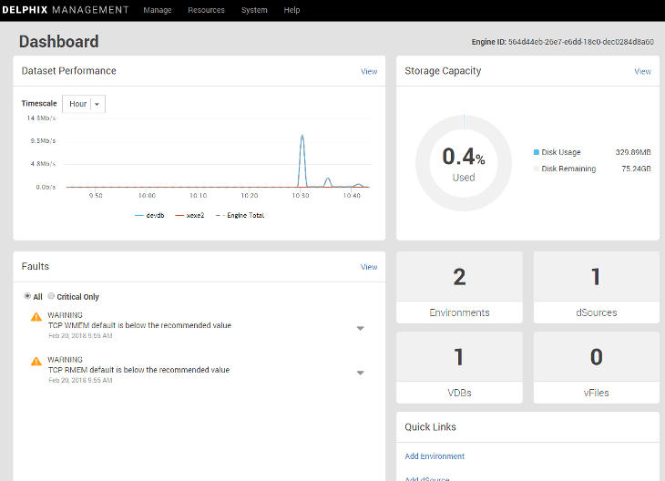
I think anyone whose role it is to support Delphix will be happy with this screen as it shows the current usage and health of the system at a glance. Drilling down is as simple as clicking the View links. From here we can also use the Quick Links to add new environments, dSources and groups.
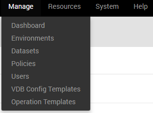
The drop down menus at the top of the interface have slightly changed making them more concise and categorized better.
Datasets
To get to the Datasets view we now need to pick it from the Manage menu and this is where some big changes have taken place, especially with the Timeflow view. You’ll notice the Datasets pane down the left hand side is the same as in 5.1, as is the Actions pane on the right. This is because these were the first areas of the interface to get the de-Flash treatment in version 5.1.
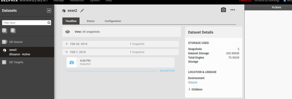
In the previous versions here we had timecards that cycled through left to right from the oldest to the newest and this was probably one of the slowest parts of the interface to render. Now we have a simple non-graphical list that is so much more snappy.

To perform any actions with a particular snapshot (timecard) you just need to select it and click one of the buttons within the snapshot. Hovering over the buttons shows a pop-up description of the what action the button performs – useful when you’re first finding your way around.
And you’ll notice this theme throughout, whereas before every action had its own button somewhere in view we now have less buttons in view but with a new one depicted by three dots (…) which I think most of us have come to know means it will offer us more options. We can see this at the top of the dataset view where the controls for the dataset have been redesigned in the same way.

While we’re on the Datasets screen there’s a couple of other changes here that have improved how we view information. Firstly, the Status tab now shows us recently completed jobs for that dataset and the Configuration tab now has a Policies screen that shows us the policy configuration.
Add dSource and Provision VDB
The next big change are the screens used to add dSources and provision VDBs. They both follow a new wizard style window, which incidentally is the same format used when you initially configure the engine.
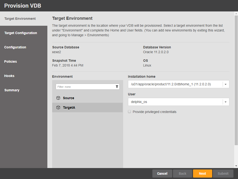
I like these new screens. I feel they are modern, clean looking and easy to navigate.
Add User
The rest of the Management Interface follows the same theme so I’m not going to walk through every screen but before I finish there’s one more section I’ll cover and that is the User administration screen and specifically the Add User wizard.
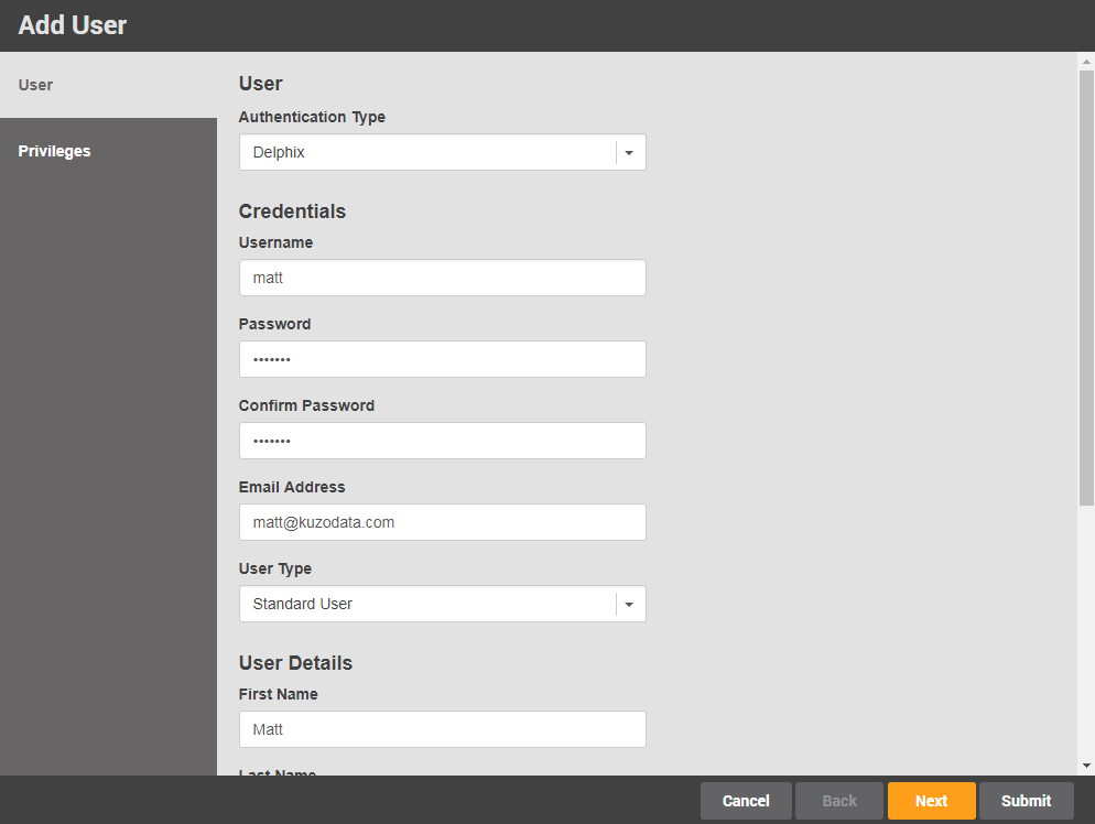
In versions prior to 5.2 this was not a wizard and was easily misunderstood at first. It just wasn’t an intuitive process. But now, when we click the + button, we are taken through a screen similar to the dataset wizards and it flows onto the privileges section before we hit Submit (before you had to add the user and then select the user to work through the privileges from a separate tab). This ensures you work through the whole user configuration in one go.
As the title of this post suggests, I just wanted to take a look at the new look and feel of version 5.2 of the Management Interface and not look at the new features within it. I’ll write something on that later. I think Delphix have done a great job with the redesign and I know they put a huge amount of effort into getting it right in one release. I believe that with the modern and slick look they have achieved, their users will now be as impressed with the interface as they are with the core functionality of the Delphix Dynamic Data Platform.

Matt is a technology consultant with over 20 years experience helping organisations around the world achieve data success using proven and emerging technologies. He is the Principal Consultant and Head Trainer at Kuzo Data.
Connect with Matt on LinkedIn.